Whilst it would be nicer to plot the visualisations using bokeh as there is interactivity, the Jupyter Book format does not enable the use of bokeh at this current point in time, thus we will use matplotlib and seaborn to create static plots.
Note, we have created a helper function which also includes relative-positioning of the 'title-box'. This was inspired by the matplotlib documentation.
import matplotlib
import matplotlib.pyplot as plt
import seaborn

%matplotlib inline

# create helper function that places text box inside a plot
## so acts like an 'in-plot title'
def add_titlebox(ax, text):
    # build a rectangle in axes coordinates - should parameterise these as arguments
    left, width = .25, .5
    bottom, height = .25, .5
    right = left + width
    top = bottom + height

    ax.text(x = right, y = top, s = text,
            horizontalalignment = 'right', verticalalignment = 'top',
            transform = ax.transAxes,
            bbox = dict(facecolor = 'white', alpha = 0.6),
            fontsize = 12.5)
    return ax
# pass in variable from other notebook
%store -r data_join

# wrangle
## set `region` to be categorical
data_join['region'] = data_join['region'].astype('category')

# check column data types
data_join.info()
# check all unique values in `region`
data_join['region'].unique()
Below, we plot the data now taking an object-orientated approach by following the layout instructions here.
Note, we have split our data out into three overarching groups by region:
- Europe - this has the highest proportion of guests booking hotels
- Asia and Americas - these
regionshave similar levels of guests booking hotels - Africa and Oceania - these
regionshave similar levels of guests booking hotels
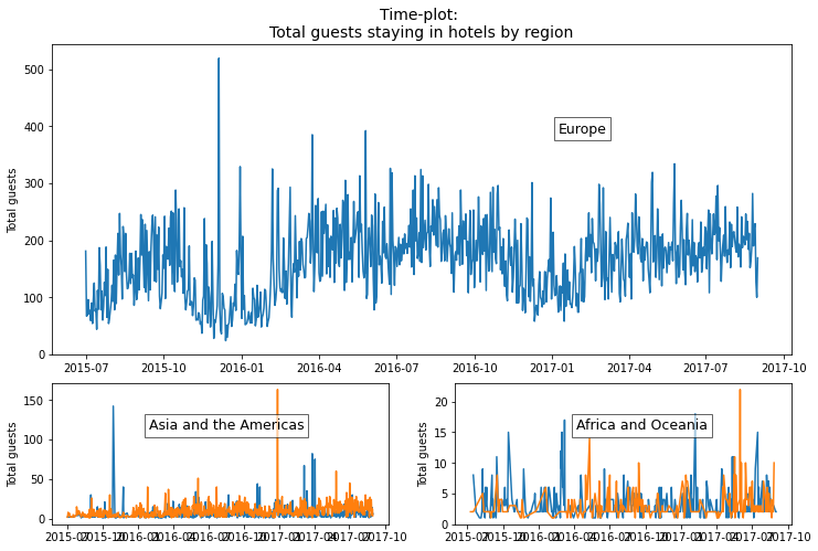
From the time-plot below, we see that:
Europe: The trend for hotel bookings is slightly falling over time with deep troughs being reached in October 2015 and December 2016. There does not seem to be clear suggestions of seasonality as noted by the absence of a seasonal pattern that is frequent year on year.
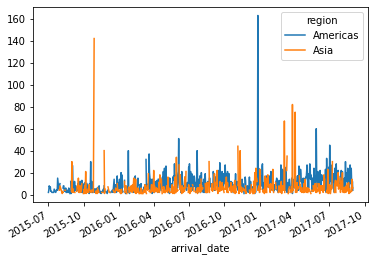
Asia and Americas: Like Europe, there does not seem to be a clear trend. However, spikes in hotel bookings to these regions occur on November 2015 for Asia and December 2016 for the Americas. Interestingly, these deep troughs seem to coincide with peaks being seen in hotel bookings in Europe. For seasonality, there is a peak for each December in hotel bookings to the Americas, with this probably being explained by the Christmas period. As for Asia, there appears to be no clear seasonal pattern, even during Chinese New Year!
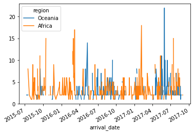
Africa and Oceania: Again, no clear trend though there are spikes in March 2016 and February 2017 for Africa. For Oceania, there is a small spike in May 2016 and a larger one in June 2017. There appears to be no seasonality noticeable from the plot, though it may hide weekly seasonality.
# take object-orientated approach to plotting

## set plotting grid
gridsize = (3,2)
fig = plt.figure(figsize = (12, 8))
ax1 = plt.subplot2grid(shape = gridsize, loc = (0, 0), colspan = 2, rowspan = 2)
ax2 = plt.subplot2grid(shape = gridsize, loc = (2, 0))
ax3 = plt.subplot2grid(shape = gridsize, loc = (2, 1))

## create plots and populate grid
ax1.set_title(label = 'Time-plot: \nTotal guests staying in hotels by region',
              fontdict = {'fontsize': 14})
ax1.plot('arrival_date', 'total_guests', data = data_join.query('region == "Europe"'))
ax1.set_ylabel(ylabel = 'Total guests')
add_titlebox(ax = ax1, text = 'Europe')
ax2.plot('arrival_date', 'total_guests', data = data_join.query('region == "Asia"'))
ax2.plot('arrival_date', 'total_guests', data = data_join.query('region == "Americas"'))
ax2.set_ylabel(ylabel = 'Total guests')
add_titlebox(ax = ax2, text = 'Asia and the Americas')
ax3.plot('arrival_date', 'total_guests', data = data_join.query('region == "Africa"'))
ax3.plot('arrival_date', 'total_guests', data = data_join.query('region == "Oceania"'))
ax3.set_ylabel(ylabel = 'Total guests')
add_titlebox(ax = ax3, text = 'Africa and Oceania')
The Asia, Americas, Africa and Oceania plots above are quite small in comparison to the Europe one. If you wish to explore them in further detail, you can click the '+' icon below to reveal the plots and code that generates them.
# focus on Asia, Americas, Africa and Oceania more
data_asiaamericas = data_join.query('region in ("Asia", "Americas")')
data_asiaamericas.pivot(index = 'arrival_date', columns = 'region', values = 'total_guests').plot()

data_africaoceania = data_join.query('region in ("Africa", "Oceania")')
data_africaoceania.pivot(index = 'arrival_date', columns = 'region', values = 'total_guests').plot()
Summary: Break-points
Therefore, from visually-inspecting the time-plots, our candidate break-points to test for a structural break are:
- Europe: October 2015.
- Asia: October 2015 and to a lesser extent, May 2017.
- America: December 2016 - possibly a bumper Christmas period where people booked hotels during this time.
- Africa: October 2015, March 2016, February 2017 and July 2017.
- Oceania: April 2016 if concerned but June 2017 more likely.
Since the number of guests staying in hotels within Africa and Oceania in this dataset are so low, we will ignore these regions in the analysis.
%store data_join


